
InStride Motion Hero
Shipped Product Feature | Role: Brand/Visual Designer
Problem: There’s user confusion about the process of signing up for education programs. We should test a subtle animation in place of a static hero to see if it improves user retention.
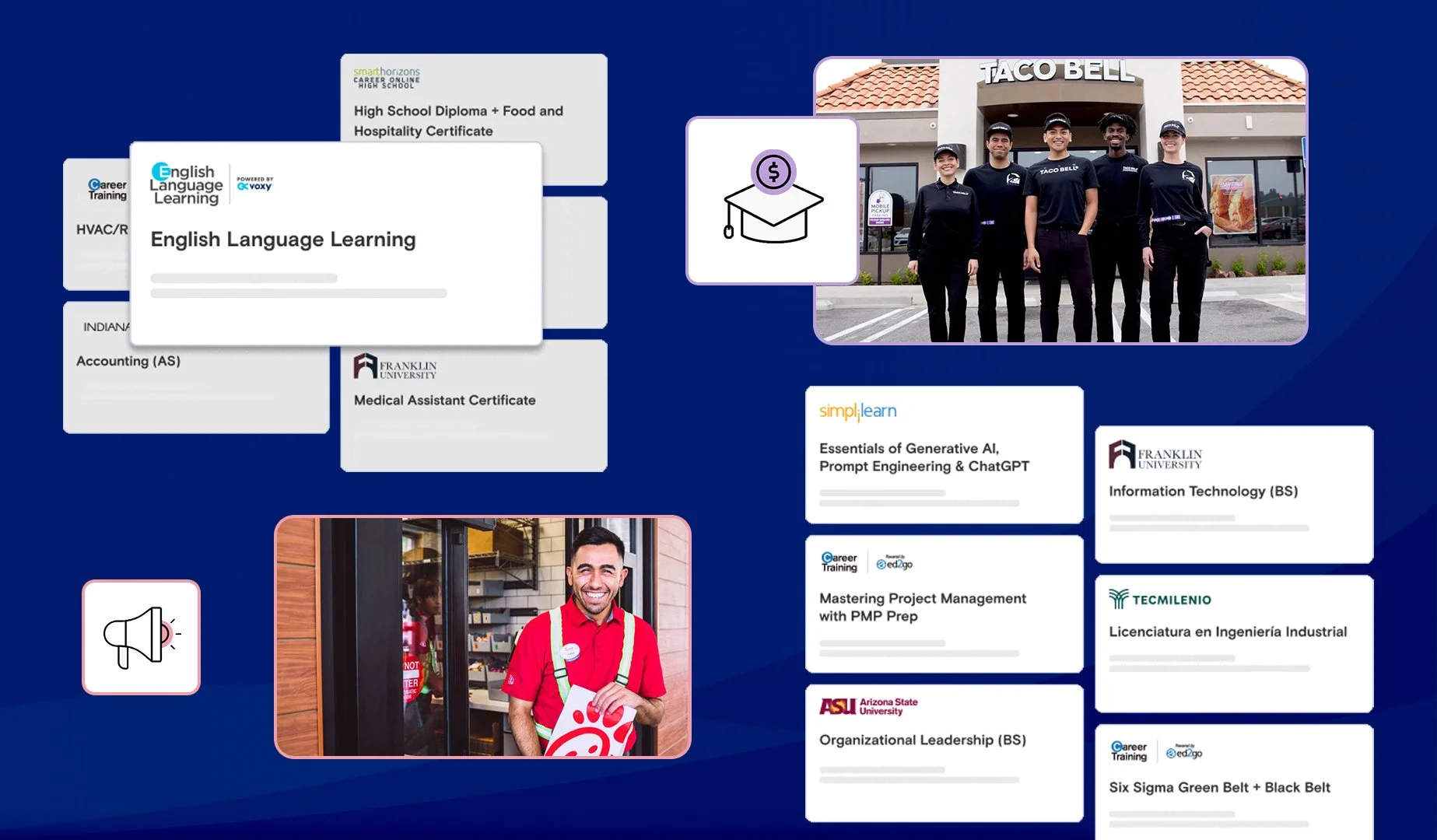
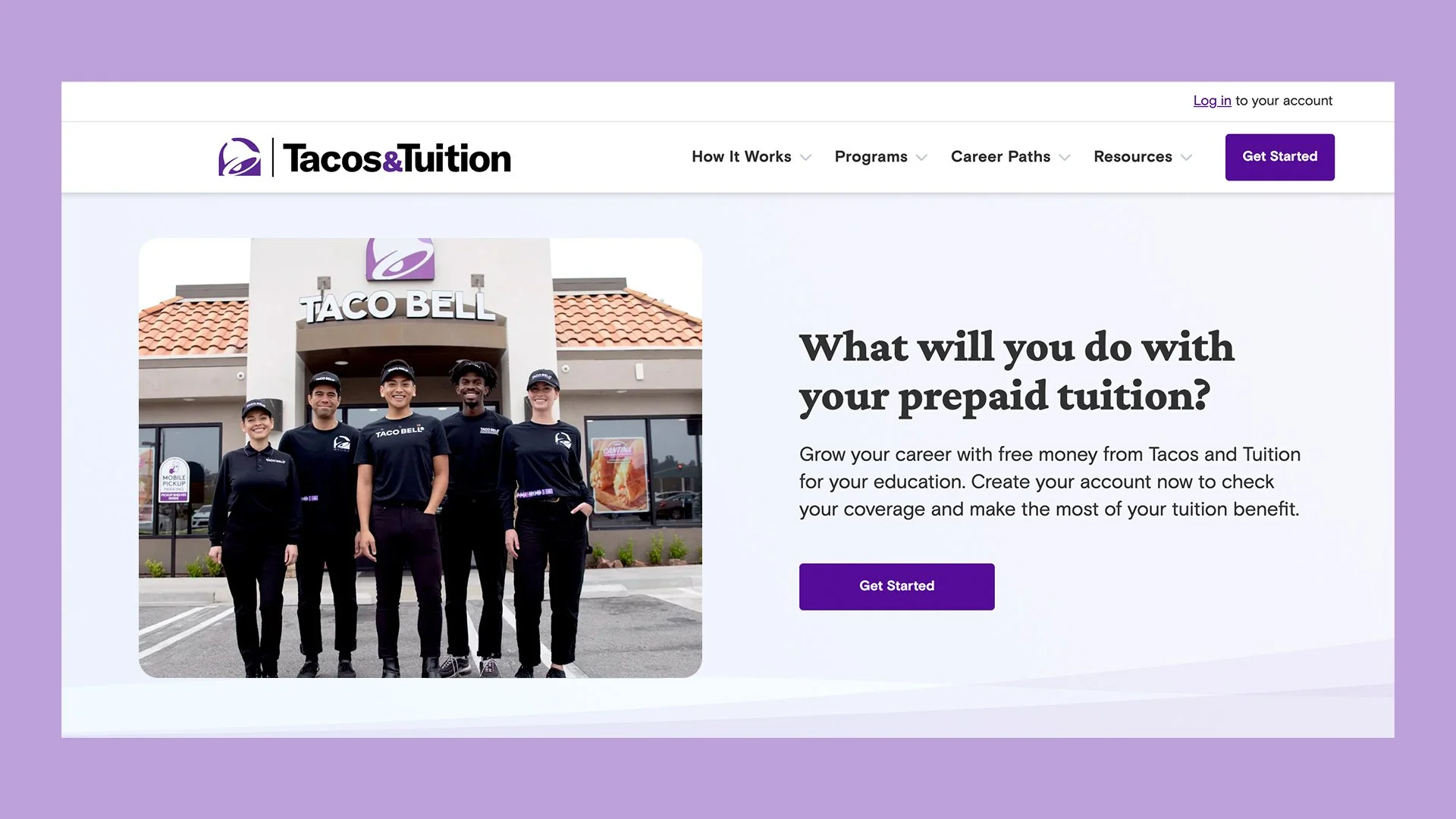
The landing page shows the static image of employees users typically saw. Knowing the majority of our users would be Gen Z employees of our corporate partners, I looked into data supporting Gen Z would respond more favorably to motion in place of static assets. One such study found that Gen Z users were 2.5x more likely to engage with motion assets in place of a static graphic. I envisioned showing teasers of sample programs to help set user expectations and provide more program clarity.
User feedback / Research

Designed to scale
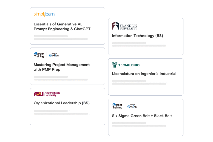
I designed simplified versions of program cards that users would see in the learner experience. This template would lend to new academic partners or programs being added in the future. Since this would live in a responsive web environment, I worked with our product team to gather ideal specs and file size for desktop, tablet, and mobile devices.
Animation / Compression
I built each frame in Figma, and iterated on which animation style and speed would be enough to highlight 3 different programs smoothly but quickly. You’ll notice I also added shadows to the foreground cards and overlays to the background cards for more visual contrast.
I then compressed the GIFs to a small enough file size to not impede image quality or page loading speed.
A/B Test Results
The test results confirmed our initial research, when tested alongside the static hero, the animated hero resulted in a 300% increase in clickthrough. All learner experience homepages currently use their own unique iteration of this animation.